12.26.2016
10.03.2016
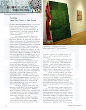
Chromatic Space in Lower Manhattan
.
"From the rigorous flatness of hard edge painting to the celestial expanse of color field work, color can enhance or defy the flatness of the canvas, and activate the work in an exciting variety of ways. Dialogues of translucence and opacity, movement and stasis, surface and depth are played out through the use of color in the work of different abstract artists."
--Jonathan D. Lippincott, curator of Chromatic Space
 Chromatic Space is on exhibition at the Shirley Fiterman Art Center in Lower Manhattan through November 5. It's the third exhibition this year to celebrate the 80th Anniversary of American Abstract Artists. (My walk-through of The Onward of Art, which took place early in the year, is here.) Sixty-five current members are represented, along with three past members and five invited guests. This post will give you a sense of the show, which spreads out in the Fiterman Art Center's three galleries. Because I am a member of AAA with a painting in the show, I cannot make this a review or even a report, but I can take you through it photographically.
The Fiterman Art Center consists of three spaces: Gallery A, a large space with two walls of windows illuminating two exhibition walls; Gallery B, a long hallway wide enough to allow the viewer to step back to see the work on its walls; and past that, Gallery C, a large exhibition hall with windows at one end. We start in Gallery A and move clockwise around the room. Given that the thesis of the show is color, you will see shifts and relationships as we move around this gallery, and from one gallery to another.

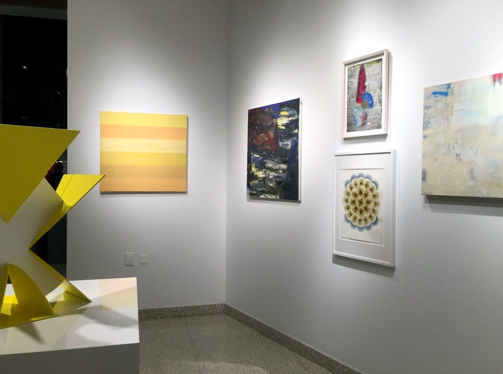
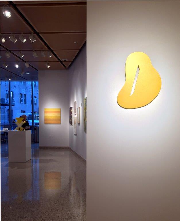
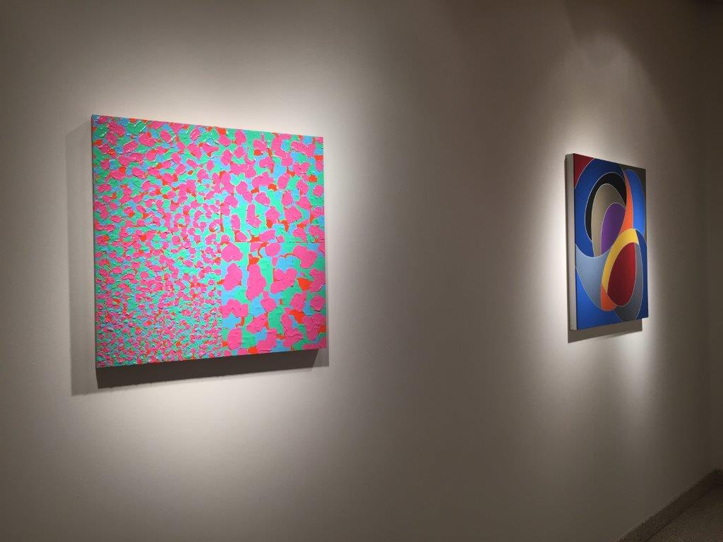
In Gallery A, a panorama of two walls. The entrance is behind that far wall. Click pic to enlarge

From left: Merrill Wagner, 6 Brands of Naples Yellow, 2009, oil on linen; and George Sugarman sculpture, Yellow X, 1994, acrylic on aluminum
(I'm including titles in the group shots and more specific information in the individual images, but because you can get a sense of scale from the installations, I've skipped the dimensions)
(I'm including titles in the group shots and more specific information in the individual images, but because you can get a sense of scale from the installations, I've skipped the dimensions)
Sugarman and Wagner; then from left, seen here and below: Iona Kleinhut, Twilight; Lynn Umlauf, 7.30, 1994 (top), and Babe Shapiro, Calcium Night Lite; Irene Lawrence, To Get There/9
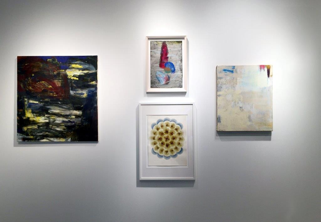

To the right of Sugarman: Claire Seidl; Jeanne Wilkinson; Gail Gregg; Susan Bonfils, Orion; Stephen Westfall

Claire Seidl, Second Nature, 2005, oil on linen
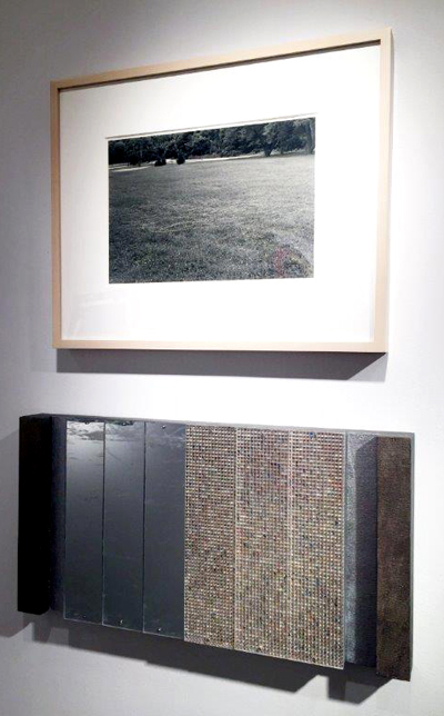
Jeanne Wilkinson, Crossings 2, 2000-2016, watercolor, ink and graphite on paper. This work is shown framed
 Gail Gregg, Flicker, 2003, encaustic on panel

Stephen Westfall, Persona, 2009, oil and alkyd on canvas

On the wall just to the right of Westfall's painting is this one by Siri Berg: The Black Sheep, 2015, oil on board, 60 x 10 x 1 inch. (I've given you dimensions because you don't see this painting in relation to the others.)
A retrospective of the nonagenarian Berg, curated by Peter Hionas, will be the show after this
A retrospective of the nonagenarian Berg, curated by Peter Hionas, will be the show after this

We're swinging around Gallery A to this wall, which is the one you see from a distance when you enter from the street. From left: Vincent Longo, Don Voisine, Roger Jorgensen, Robert Murray

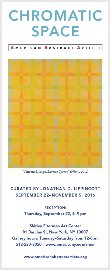
Vincent Longo, Lattice Spread Yellow, 2012, acrylic on canvas

Panorama with Voisine, Jorgensen, Murray; Philis Ideal, Richard Timperio
Click pic to enlarge

Don Voisine, Noir (Confidential), 2016, oil on wood panel

Roger Jorgensen, Figures on the Beach, 1953, oil on linen

Robert Murray, Kings Penn Road, 2008, aluminum
Philis Ideal, Heap, 2012, acrylic, collage, resin on panel

Richard Timperio, Green Line, 2016, acrylic on canvas
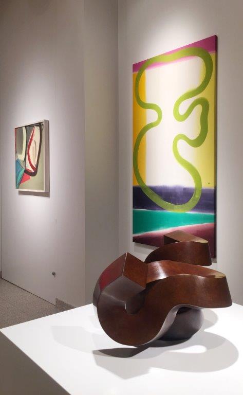
Ldeal, Timperio and Clement Meadmore

Clement Meadmore, Elaboration, 1997, bronze
Photo: Fiterman/AAA
Photo: Fiterman/AAA

Ronald Bladen, Flying Fortress (model), 1974-1978, painted wood
Photo: Fiterman/AAA

Having made a complete tour of Gallery A, we're walking toward Gallery B. Emily Berger's painting is in the distance. You'll see it in closer view as you scroll down
With Longo and Voisine over our left shoulder, we look back into Gallery A and over to the first work in Gallery B: Katinka Mann, Gone To, 2015, flattened sculptural painting

Mann; Lorenza Sannai, Diagramma, 2016, acrylic on canvas

Sannai; Raquel Rabinovich, I am Between Heaven and Earth 1, 1986-87, monotype on Arches paper; Emily Berger

Emily Berger, Morning, 2016, oil on wood
Photo: the artist
Photo: the artist
Though I shot these two works from the opposite direction, they follow Berger's work on the wall:
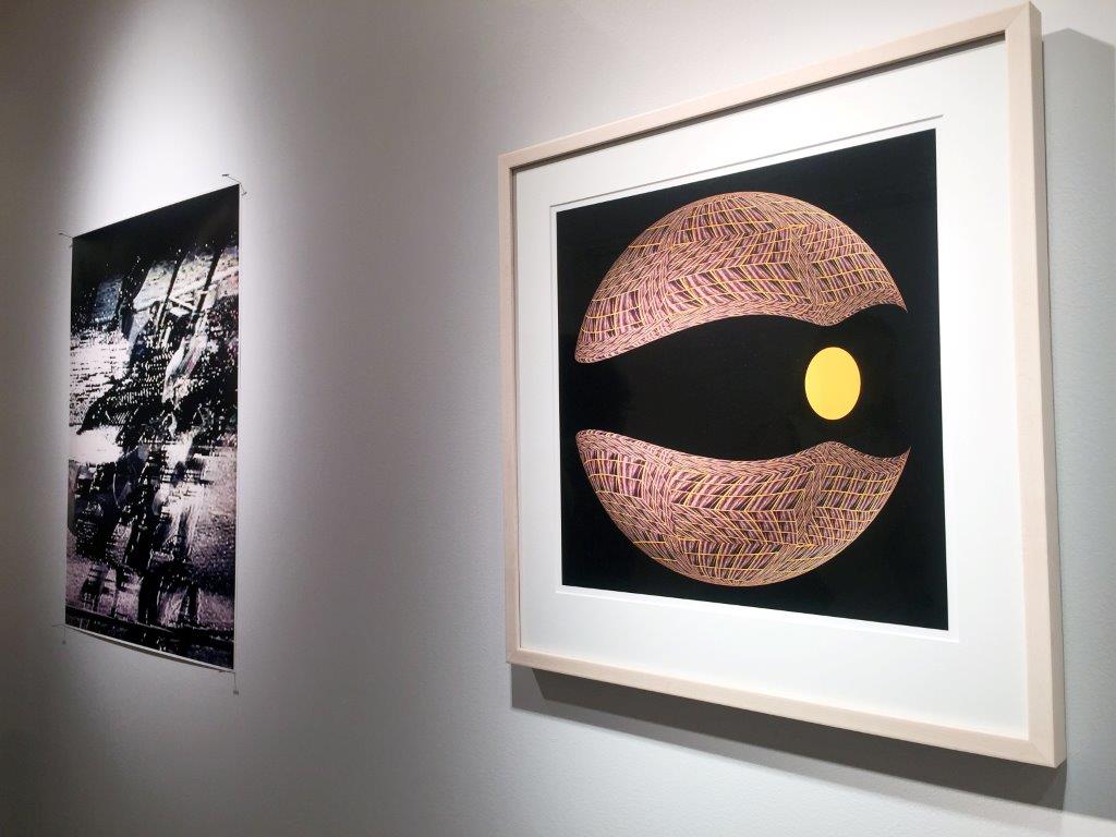
Marvin Brown, Untitled, 2015, digital print; James Seawright and Mimi Garrard, Chromatic #1, 2016, digital print

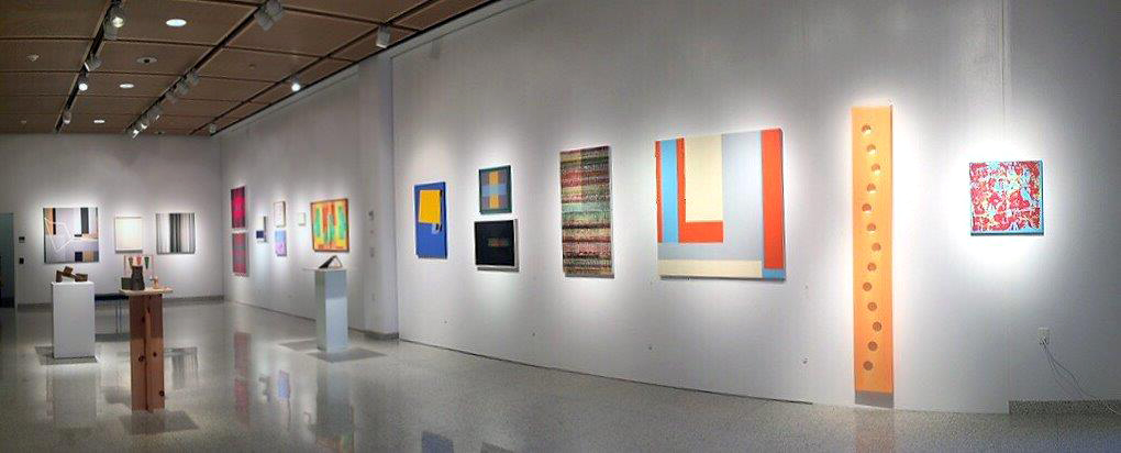
Foreground: Ramon S. Alcolea, Rain and Moon, 2016, wood; center top: Judith Murray, Strider, 1981, oil on linen; David McKenzie, #13-2011-N1, 2011, acrylic on engineered canvas; John Obuck
John Obuck, Thirteen Over One (Ghost Version), 2016, oil on canvas

Here's a view of the wall from the opposite direction. (I'll show you the opposite wall on our way back)

Lynne Harlow, Baker Bridge Road 1, 2015, acrylic on Plexiglass, 4 x 4 x 1 inch

James Gross, Winter, 2003, collage on canvas

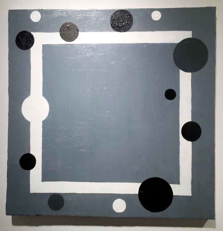
Martin Ball, Untitled; Cecily Kahn, Untitled

Ce Roser, Cloud Geography, 1983, oil on canvas


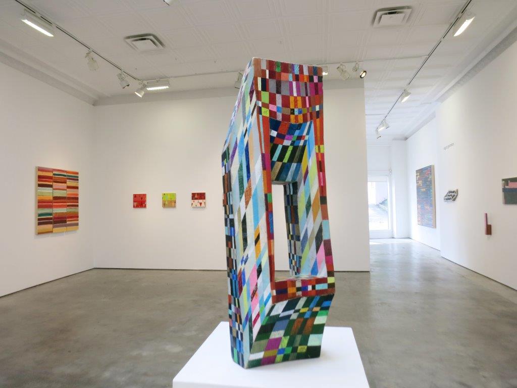
Panoramic view of two walls in Gallery C
Click pic to enlarge
Manfred Mohr, P1611_5220, 2013-13, pigment in on canvas

Victoria Burge, Light Study 1, 2015, relief print with embossing

Gabriele Evertz, Grays and Metallics (Tallit), 2014, acrylic on canvas

Daniel Hill, #9504, 1995, acrylic on two canvases
Photo: Anne Russinof

Mark Williams, Stand Out, 2010, acrylic latex on linen

Power Boothe, Ellipsis #39, 2016, gouache on paper

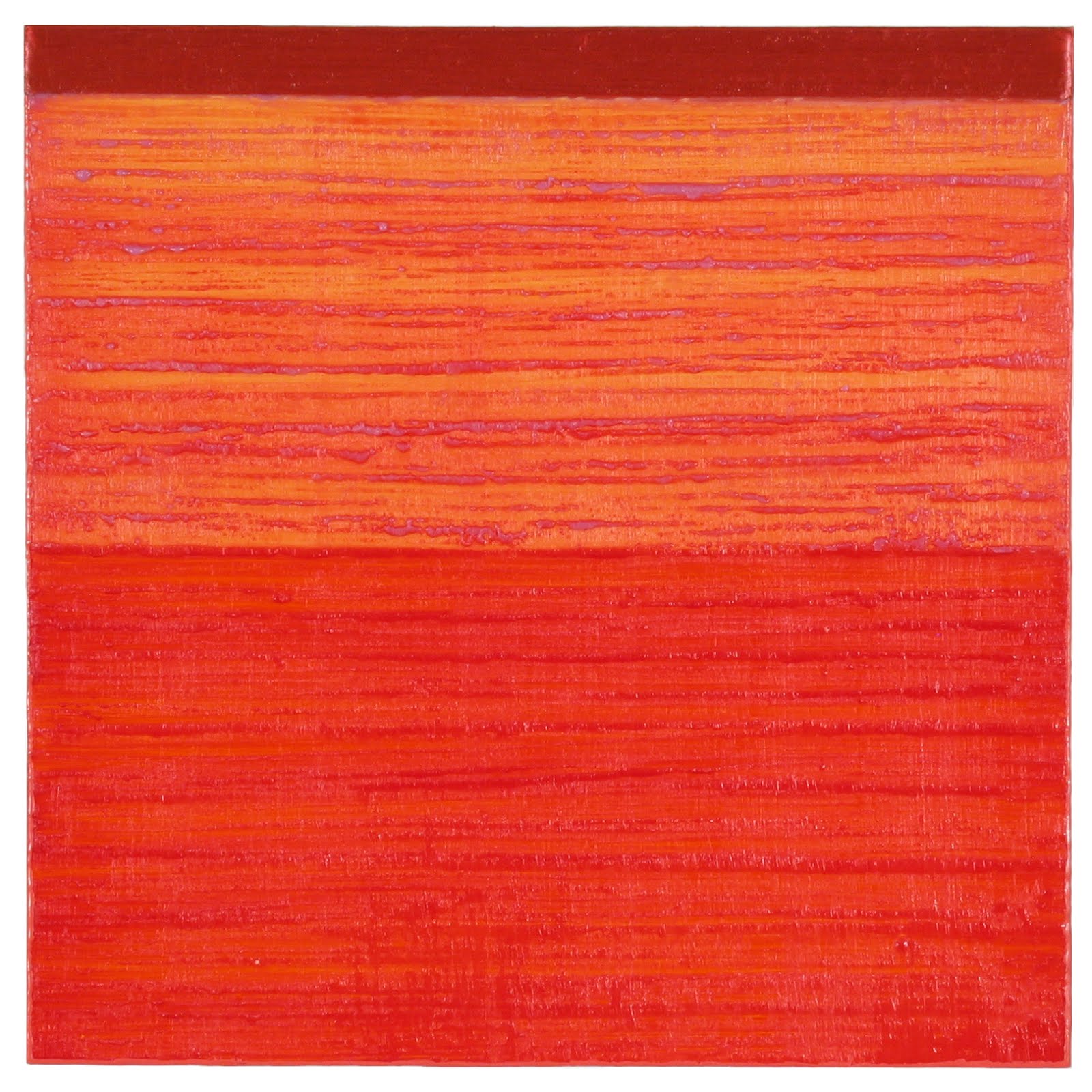
Joanne Mattera, Chromatic Geometry 28, 2015, encaustic on panel

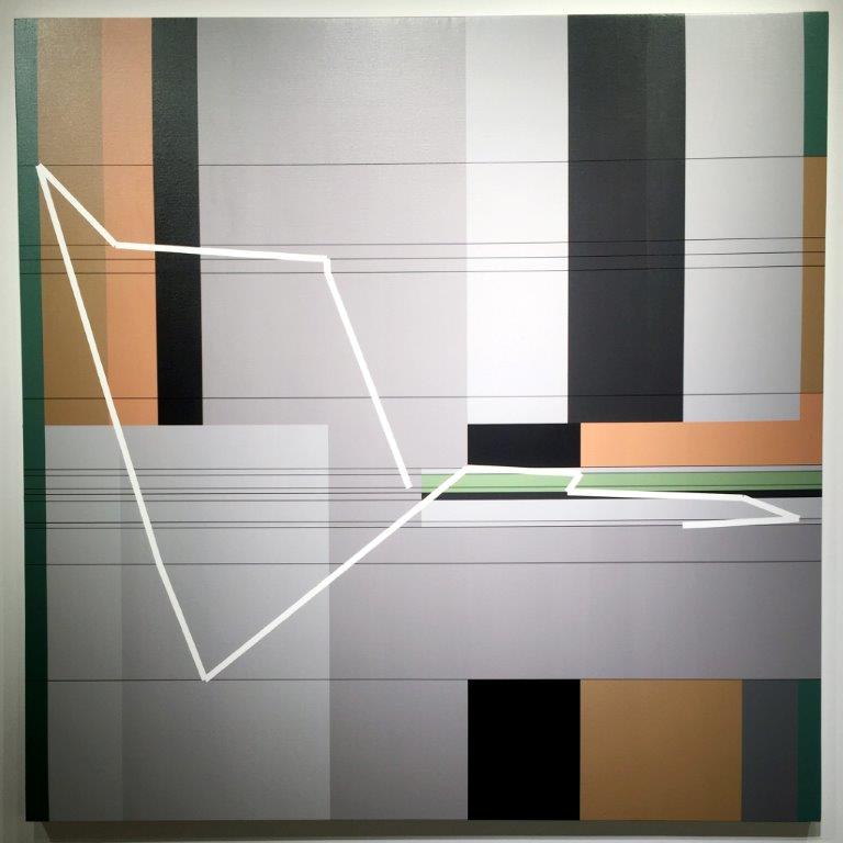
Henry Brown, Parallel, 2015, acrylic, pencil, gesso on canvas

Thornton Willis, Stones of Jerusalem, 1986, casein on paper

James Rosati, Penine 1, 1963, bronze
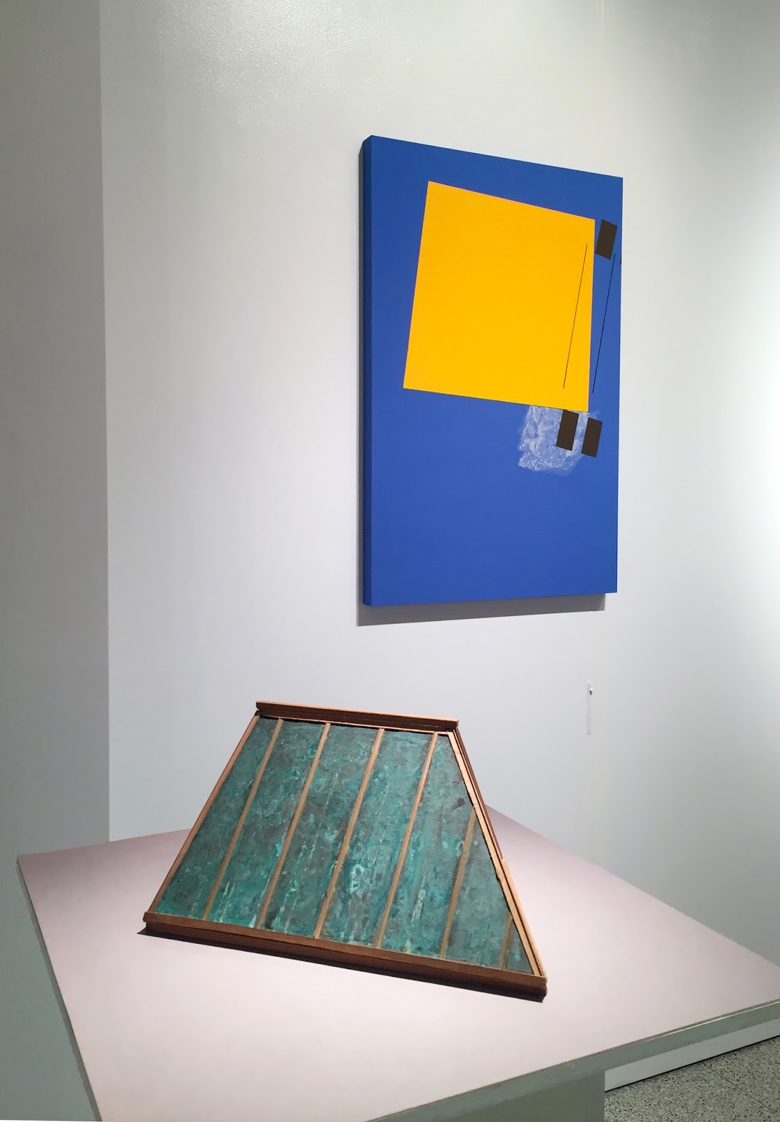
Foreground: Alice Adams, Roof Landing model, 1985, wood and copper-coated plastic; Lucio Pozzi, Pleasant Dissatisfaction, 2016, acrylic on board
View of Gallery C from the far end of the space
James Juszczyk, Cool & Lucid, 2016, acrylic on canvas (top); Sharon Brant, Throwing a Die to Fill in Space #4, 1977, Nu-pastel and graphite pencil on black paper

Creighton Michael, Chronicle 616, 2016, layered acrylic with digital transfer on wood panel

Julian Jackson,View 1, 2016, oil on canvas

Mary Schiliro, Skinny Dip 3, 2016, acrylic on Mylar

Stephen Maine, P16-0321, 2016, acrylic on canvas
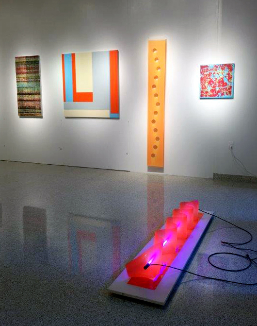
Michael, Jackson, Schiliro, Maine; James O. Clark

James O. Clark, Violaceous, 2012, vinyl, argon, light

Panorama of opposite two walls in Gallery C
Click pic to enlarge
Kim Uchiyama; Jane Logemann, b-blue; Steven Alexander

Kim Uchiyama, Light Study #41, 2016, oil on linen

Steven Alexander, Source, 2013, acrylic on canvas

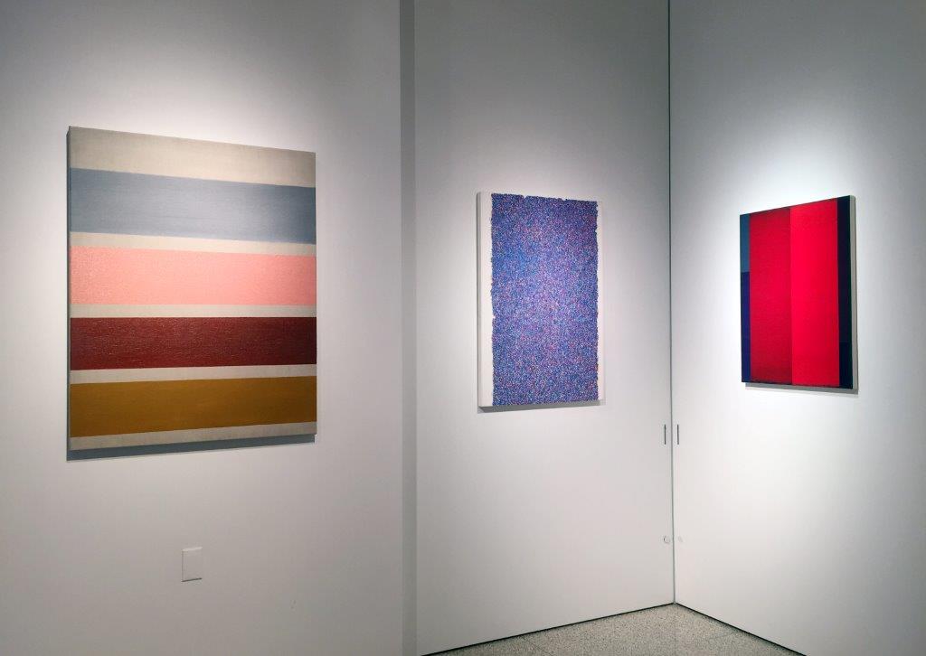
Nola Zirin, Moon Game, 2016, oil, enamel, glitter, mixed media on panel

Mara Held, Doorkeeper, 2016, egg tempera on linen over panel
Li .Trincere, Black 2, 2016, acrylic on canvas; Anne Russinof; Marthe Keller, Raucous, 2007, acrylic on linen
Anne Russinof, Dervish, 2015, oil on canvas
Two views
Jim Osman, Yard, 2015, wood, paint, tree section

View of Gallery C during the opening
Photo: Fiterman/AAA
Now we walk back through Gallery B, looking at the work on our left . . .

Robert Swain, Untitled: ID #BS-232, 2016, acrylic on birch panel
Swain; Corey Postiglione, Tango Interlude #26, 2016, acrylic on canvas

Mark Dagley, Mystery of the Grail, 2015, acrylic on canvas; Nancy Manter; Clover Vail

Nancy Manter, Drive-By #3-4, 2015, flashe and charcoal on Yupo

Clover Vail, Untitled, 2016, sumi ink and ballpoint pen on wood panel
Edward Shalala, Untitled: Rocky River Reverse, Ohio, 2011, #10 raw canvas thread, documentary photography (top); Susan Smith, Mirrors, Plexi, Canvas, 2015, found mirrors and plexi with oil on canvas panels

Vera Vasek, Core Rotation, 2016, acrylic, particulates on Plexiglas
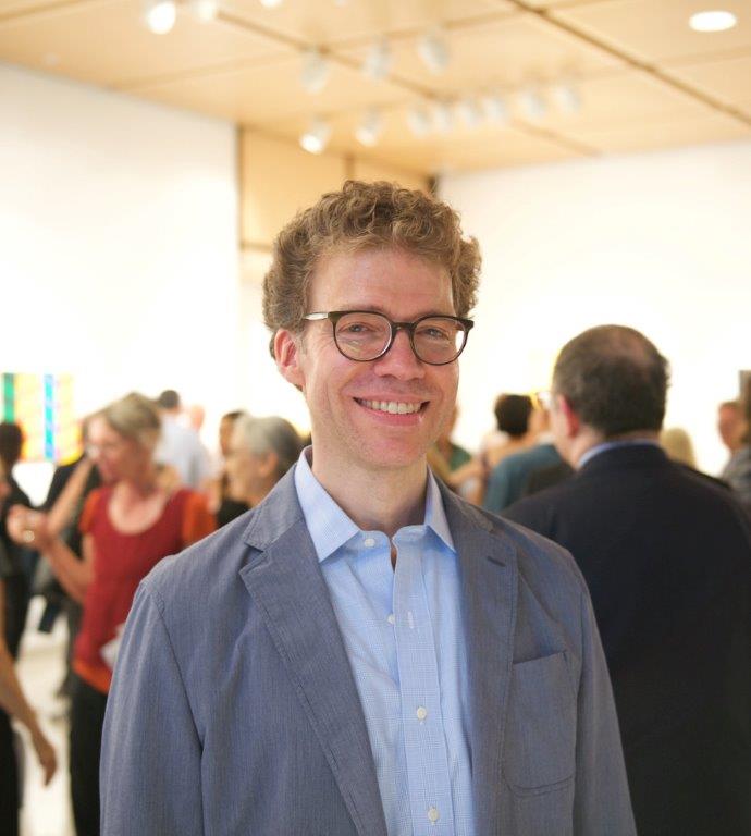
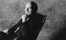
Curator Jonathan D. Lippincott
Photo: Fiterman/AAA
If I may be permitted a brief post-walk-through remark, I'd like to note not only the range of aesthetic expression, as Lippincott did in the comment that opened this post, but the period over which these works were created. The curator selected some paintings and sculptures that were made in previous decades, while in other instances he selected paintings newly off the easel. To me the chronologic diversity added depth not only to the history of American Abstract Artists as a group, but also to abstraction in general.
Chromatic Space is up through November 5 at the Shirley Fiterman Art Center. The galleries are open five days a week. Info here.
Added 10.7.16: See a video of the exhibition with commentary by the curator, Jonathan D. Lippincott
Subscribe to:
Posts (Atom)